Friday, 16 October 2015
Final Website
here is a link to our website:
https://invis.io/JP4KM12VC
here is a video of the final website in use:
https://www.youtube.com/watch?v=PYDM7oKVsQM&feature=youtu.be
Thursday, 15 October 2015
Wednesday, 14 October 2015
Website: Learn Page
For my learn page, I wanted to provide the viewer with some information about the affects that pollution is having on people, wild life, and our future. At first I thought that I would have this page with a grid of facts and illustrations but I didn't like any that I was making until I came up with the idea that I could make a few main bullets points and draw symbols for each. For the people icon I chose to draw a hand, for the fish icon I drew some simple fish, for the bird icon I drew a feather and for the future icon I drew an hourglass.
Website: Event Page
I decided to put a little bit of event info on the website for our participants to see before the event. I wanted to include a sort of map of the beach and a few important places to remember for the day. I made a key to make it easier for the viewer to navigate the map.
The next section of the page was the 'what we provide' and 'what to bring' section. I wanted to use some hand drawn looking illustration to make it more comprehensive. I chose to do these illustrations in a different style to the characters because I wanted the characters to remain separate from these. Also to show a hierarchy amongst the illustrations. I tried a few different ways of doing this but in the end I decided to use line and block colour to keep it bold and simple.
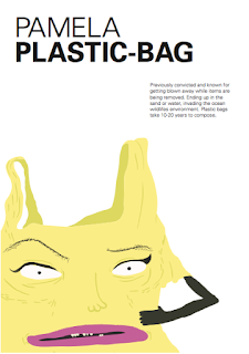
I included a few characters on this page because the page had quite a lot of content which I saw as an opportunity to play around with the characters.
Subscribe to:
Comments (Atom)


