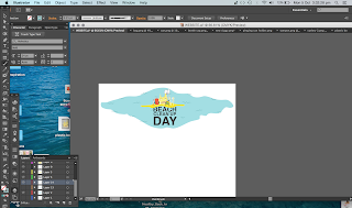
This is a progression of developments that I made for the home page of the website. I initially started off with the stencil font that Gray suggested but as the rest of our design began to take a different kind of style it no longer worked. We decided to stick to something for simple and we tried Helvetica (and liked it).
I then began playing around with composition with the water, text and characters. I tried both handwritten font and helvetica for the menu bar and decided to stick with helvetica. As for the water, I decided to add some hand drawn elements to give it a bit more dimension and also to it linked in with the style of the characters.
The compisition of the text was something that I played around with a lot as we decided we wanted quite stuctured text to contrast with our less structures characters. In the end we decided to take the "day" out of the title because we want our audience to know this this doesn't have to be a one off event.


No comments:
Post a Comment