Wednesday, 14 October 2015

Website: About Page

After a feedback session in class, we got the idea of having the characters interacting with the content on the website. We decided that we want to keep the idea of having our characters as 'baddies' so we wanted them to be doing naughty things with the content on the page.

I played around with the placement and size of the text because I wanted to make sure the page was balanced. In the end we decided to add an illustration of a sand castle because we thought it would look cool with the background texture


Website: Homepage

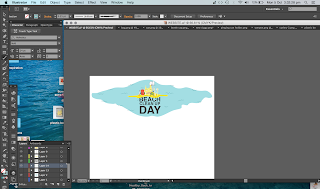
This is a progression of developments that I made for the home page of the website. I initially started off with the stencil font that Gray suggested but as the rest of our design began to take a different kind of style it no longer worked. We decided to stick to something for simple and we tried Helvetica (and liked it). 

I then began playing around with composition with the water, text and characters. I tried both handwritten font and helvetica for the menu bar and decided to stick with helvetica. As for the water, I decided to add some hand drawn elements to give it a bit more dimension and also to it linked in with the style of the characters.

The compisition of the text was something that I played around with a lot as we decided we wanted quite stuctured text to contrast with our less structures characters. In the end we decided to take the "day" out of the title because we want our audience to know this this doesn't have to be a one off event.


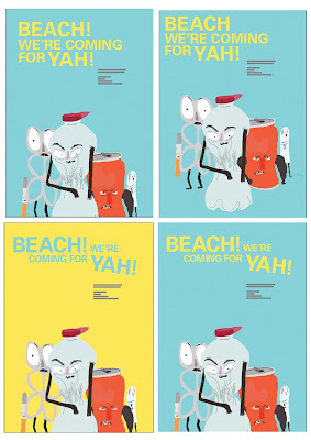
Iterations of brochure and poster design/ refining to get the final


Further Brochure development shown week 6 monday-SLC


Poster and Brochure-SLC


shown at interim week 5


left poster shown at week5 interim 

development and iterations of both the poster and brochure since having finalized our chracaters


Character Finals

These are our finished characters: